
Advanced Techniques for Dynamic Calendar Visuals

Power BI is a powerful tool for visualizing data and uncovering insights through interactive reports and dashboards. One key element in many business intelligence reports is the calendar visual, which helps track time-based metrics such as sales, revenue, tasks, or projects. By creating dynamic calendar visuals, you can present time-related data in an intuitive and engaging way. This guide explores the importance of dynamic calendars and how to create them effectively in Power BI.
1. What are Dynamic Calendar Visuals?
Dynamic calendar visuals allow users to interact with data based on time periods, such as daily, weekly, monthly, quarterly, or yearly. These visuals can update dynamically according to filters or slicers, enabling users to:
- Visualize Data Over Time: Show how metrics such as sales, customer activity, or project completion have evolved.
- Monitor Key Performance Indicators (KPIs): Track performance on a daily, monthly, or yearly basis.
- Analyze Trends and Patterns: Identify patterns like seasonality or growth over specific periods.
2. Benefits of Dynamic Calendar Visuals in Power BI
- Interactive Exploration: Users can adjust the time range to view different periods and explore specific trends or anomalies.
- Custom Time Aggregation: It allows for viewing data in various time increments (daily, weekly, monthly) depending on the business needs.
- Efficient Reporting: Time-based visuals make it easier to report on time-sensitive data like financial performance, customer behavior, or operational metrics.
- Improved Decision-Making: By analyzing trends over time, organizations can make data-driven decisions with more confidence.
3. Key Components for Building Dynamic Calendar Visuals
- Date Table: A well-structured date table is crucial for any dynamic calendar visual in Power BI. The date table typically includes columns such as year, quarter, month, week number, and day, along with additional fields for fiscal periods or holidays.
- Slicers: Slicers allow users to filter the calendar visual dynamically based on custom date ranges. Slicers can be used to filter data by year, month, quarter, or even custom time periods like fiscal years.
- Time Intelligence Measures: Power BI’s DAX (Data Analysis Expressions) functions help in building time intelligence measures like Year-to-Date (YTD), Month-to-Date (MTD), or Previous Year Comparison. These measures drive powerful calendar insights.
4. How to Create a Dynamic Calendar Visual in Power BI
Here’s a simple process for creating a dynamic calendar visual in Power BI:
Step 1: Build a Date Table
A date table is essential for any time-related analysis in Power BI. You can create a date table using DAX functions:
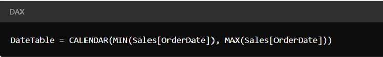
This table will include all necessary dates that correspond with the data in your report.
Step 2: Add Time Columns to the Date Table
Expand your date table by adding columns for different time frames:
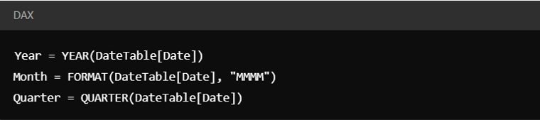
These additional columns make it easy to filter and group data.
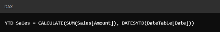
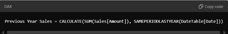
Step 3: Create Time Intelligence Measures
To analyze performance over time, create dynamic measures using DAX. For example:
- Year-to-Date (YTD) Sales:
Previous Year Sales:
Step 4: Add Calendar Visual to Report
You can use Power BI visuals like:
- Matrix Visual: Create a grid that shows time (days, months, years) as rows or columns with associated metrics like sales or tasks.
- Heatmaps or Conditional Formatting: Apply color coding to indicate high or low values across different time periods, such as days of the week or months of the year.
Step 5: Use Slicers for Interactivity
Add slicers for the user to dynamically filter the data by month, quarter, year, or custom date ranges. You can use the slicer panel to allow quick selection of specific timeframes, and the calendar visual will update accordingly.
5. Advanced Techniques for Dynamic Calendar Visuals
- Rolling Period Analysis: With DAX functions, you can calculate rolling periods like Last 12 Months or Last 90 Days, giving users more flexibility to analyze trends.
- Fiscal Year Calendar: Many businesses operate on a fiscal year rather than a calendar year. In such cases, you can customize the date table to align with fiscal periods.
- Drillthrough: Enable drillthrough to allow users to click on a specific time period in the calendar visual and navigate to more detailed reports (e.g., daily sales breakdown).
6. Real-World Use Cases
- Sales Performance Tracking: A company can use dynamic calendar visuals to monitor daily or monthly sales, analyze peak seasons, and track performance against targets.
- Project Management: Calendar visuals help in tracking project timelines, task completion, and resource allocation across different timeframes.
- Marketing Campaigns: Businesses can visualize campaign performance over time, identify the best times to launch promotions, and analyze engagement by month or day.
Conclusion
Dynamic calendar visuals in Power BI are a powerful tool for visualizing time-based data, offering deep insights and interactivity. Whether you're tracking sales performance, monitoring project progress, or analyzing seasonal trends, these visuals enhance data storytelling and empower better decision-making. By leveraging DAX for time intelligence and using interactive slicers, Power BI allows users to explore data in meaningful ways and take action based on timely insights.