
Use the Azure Maps Power BI visual.
The Azure Maps Power BI visual provides a rich set of data visualizations for spatial data on top of a map. It's estimated that over 80% of business data has a location context. The Azure Maps Power BI visual can be used to gain insights into how this location context relates to and influences your business data.
What is sent to Azure?
The Azure Maps Power BI visual connects to cloud service hosted in Azure to retrieve location data such as map images and coordinates that are used to create the map visualization.
- Details about the area the map is focused on are sent to Azure to retrieve images needed to render the map canvas (also known as map tiles).
- Data in the Location, Latitude, and Longitude buckets may be sent to Azure to retrieve map coordinates (a process called geocoding).
- Telemetry data may be collected on the health of the visual (for example, crash reports), if the telemetry option in Power BI is enabled.
Other than the scenarios previously described, no other data on the map is sent to the Azure Maps servers. All rendering of data happens locally within the client.
Use the Azure Maps Power BI visual
Once the Azure Maps Power BI visual is enabled, select the Azure Maps icon from the Visualizations pane.
Power BI creates an empty Azure Maps visual design canvas.
- Take the following steps to load the Azure Maps visual:
- Performing one of the two following actions in the Fields pane provides the minimal data needed to load the Azure Maps visual:
- Drag data fields containing latitude and longitude coordinate information into the Latitude and/or Longitude buckets.
- Drag data fields containing geospatial data to the Location bucket.
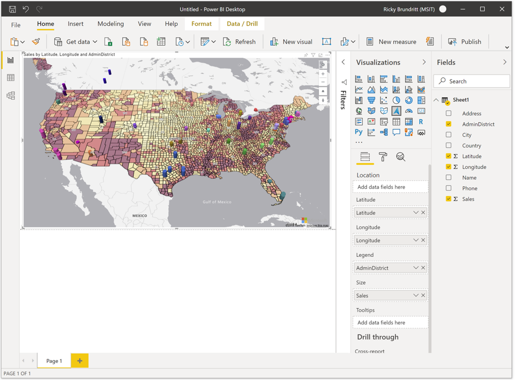
2. To color the data based on categorization, drag a categorical field into the Legend bucket of the Fields pane. In this example, we're using the AdminDistrict column (also known as state or province).
3. To scale the data relatively, drag a measure into the Size bucket of the Fields pane. In this example, we're using Sales column.
4. Use the options in the Format pane to customize how data is rendered. The following image is the same map as shown previously, but with the bubble layers fill transparency option set to 50% and the high-contrast outline option enabled.
5. You can also show or hide labels in the Format pane.
Map settings
The Map settings section of the Format pane provide options for customizing how the map is displayed and reacts to updates.
The Map settings section is divided into three subsections: style, view and controls.
Style
The following settings are available in the Style section:
Settings
Style = The style of the map. The dropdown list contains blank and blank accessible, grayscale dark, grayscale light, high contrast dark, high contrast light, night, road, road shaded relief, satellite and satellite road labels.
Show labels = A toggle switch that enables you to either show or hide map labels. For more information, see list item number five in the previous section.
View
The following settings available in the View section enable the user to specify the default map view information when the Auto zoom setting is set to Off.
Setting
Auto zoom = Automatically zooms the map into the data loaded through the Fields pane of the visual. As the data changes, the map updates its position accordingly. When Auto zoom is set to Off, the remaining settings in this section become active that enable to user to define the default map view.
Zoom = The default zoom level of the map. Can be a number between 0 and 22.
Center latitude = The default latitude of the center of the map.
Center longitude = The default longitude of the center of the map.
Heading = The default orientation of the map in degrees, where 0 is north, 90 is east, 180 is south, and 270 is west. Can be any number between 0 and 360.
Pitch = The default tilt of the map in degrees between 0 and 60, where 0 is looking straight down at the map.
Controls
The following settings are available in the Controls section:
Setting
World wrap = Allows the user to pan the map horizontally infinitely.
Style picker = Adds a button to the map that allows the report readers to change the style of the map.
Navigation = Adds buttons to the map as another method to allow the report readers to zoom, rotate, and change the pitch of the map. See this document on Navigating the map for details on all the different ways users can navigate the map.
Selection = Adds a button that allows the user to choose between different modes to select data on the map; circle, rectangle, polygon (lasso), or travel time or distance. To complete drawing a polygon; select the first point, or double-click on the last point on the map, or press the c key.
Geocoding culture = The default, Auto, refers to the Western Address System. The only other option, JA, refers to the Japanese address system. In the western address system, you begin with the address details and then proceed to the larger categories such as city, state and postal code. In the Japanese address system, the larger categories are listed first and finish with the address details.
Where is Azure Maps available?
At this time, Azure Maps is currently available in all countries and regions except:
- China
- South Korea
- Azure Government (GCC + GCC High)
Which web browsers are supported by the Azure Maps Power BI visual?
For a list of supported browsers, see Azure Maps Web SDK supported browsers.
How many data points can I visualize?
This visual supports up to 30,000 data points.
Can addresses or other location strings be used in this visual?
Yes, addresses and other location strings can be used in the Azure Maps Power BI visual. For more information on addresses and other location strings, see The location field in the Geocoding in Azure Maps Power BI Visual article.